Earlier this month the St. Louis Federal Reserve published a new briefing paper by economists William R. Emmons and Lowell B. Ricketts, in which they claimed to find recent evidence of the growing inequality trends predicted in Thomas Piketty’s Capital in the 21st Century. As asserted in the Fed paper:
“Data from the Federal Reserve’s Survey of Consumer Finances roughly match Piketty’s estimates for 1990, 2000 and 2010 and show that wealth-concentration ratios increased further by 2013, the date of its most recent survey.”
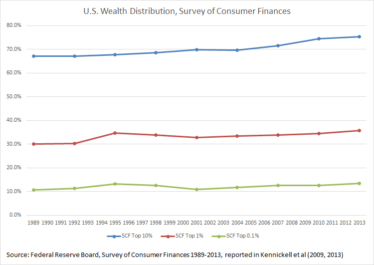
The authors proceed to illustrate this claim in a graph that overlays the “new” data with Piketty’s own U-shaped estimates of the U.S. wealth distribution over time, which I reproduce here:

As readers of this blog know, the three Piketty curves (Top 10% in blue, Top 1% in red, and Top 0.1% in green) are actually the products of extensive data massaging by their author. Piketty constructed each of these time series by literally cherry-picking data points from disparate historical sources to match his preconceived notion of a century-long U shape, and in particular a continuous rise in inequality since the 1980s (my step-by-step breakdown of how Piketty manufactured these charts may be found here).
If the “new” Fed study is accurate, it would appear to vindicate one of the most important claims of Piketty’s argument – that U.S. wealth inequality is in fact on the rise. So what are we to make of its numbers? Quite simply, things are not as they appear. There is nothing new about the Fed study at all. The Fed economists actually utilized the exact same data source that Piketty cherry-picked from while manufacturing his original trend line, the Fed’s own Survey of Consumer Finances. As a result and through their own peculiar selectivity, the Fed authors simply ended up recreating their own version of the findings in Piketty’s original – and biased – inequality construction from the same source data and then citing it as evidence of itself!
To further accentuate their findings and extend them through 2013, the Fed authors adopt Piketty’s practice of decennial averaging to obscure the lack of an upward trend line in the actual SCF returns. The raw SCF numbers from 1989 to 2013 (the period for which the SCF has used a relatively consistent survey methodology) are presented here for reference and comparison:
Note that the the supposed inequality “explosion” of the last ~25 years is not at all evident in these data. The Top 10% of the wealth share has shown a very modest and gradual increase over the period, according to the SCF. Yet the Top 1% and the Top 0.1%, or the “ultra-rich” that Piketty identifies as the supposed drivers of inequality, are at best ambiguous. They do show a small inequality jolt between 1992 and 1995, and yet both trend lines are largely flat from 1995 to the present day.
In fact, the Top 1% and Top 0.1% wealth shares in 2013 – the most recent SCF year – are practically unmoved from where they stood in 1995.
This is where the Fed authors indulged in a little pikettying of their own, so to speak. Since the raw SCF shows only modest-to-ambiguous shifts in the wealth distribution over the past two decades, it is actually in conflict with everything that Piketty predicts – including his own inequality curve, which was again derived by cherry-picking certain favorable SCF data points and excluding others. The Fed paper extends this practice by selectively averaging certain SCF returns into decennial representations, thereby turning an ambiguous inequality trend line into a clean and continuously increasing one.
This little averaging trick completely drops the 1995 SCF data points, as they conflict with the narrative of a more recent rise in inequality. The result is most apparent in the top 1% and top 0.1% time series, where the ambiguous trend lines for each (depicted in the solid lines) are both turned into an uninterrupted explosion of greater inequality (depicted in the dotted lines).
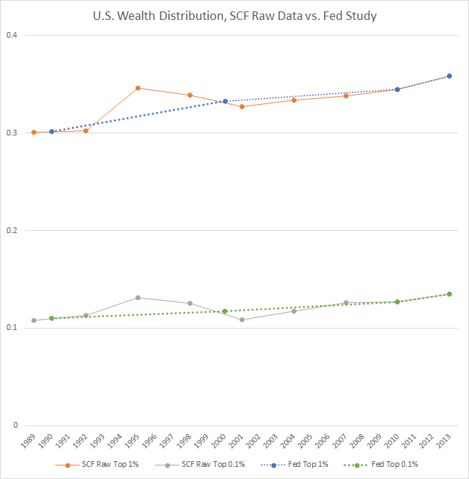
This exercise should serve as a warning to the pitfalls of cherry-picking, which seems to be an endemic habit to much of the “inequality” research of late. A look at the full SCF time series supports a very reasonable and circumspect interpretation of inequality in the past few decades. It has fluctuated around a mean, with some years showing modest upticks and other years showing modest declines. Only by selectively omitting data points is one able to turn a truly ambiguous pattern into the uninterrupted inequality explosion found in Piketty’s book and accompanying political commentary.
Far from an update to Piketty on inequality, the Fed paper’s findings are more accurately summarized as follows:
“Data we have selectively pulled from the Federal Reserve’s Survey of Consumer Finances roughly match data that Piketty selectively pulled from the Federal Reserve’s Survey of Consumer Finances.”
Instead of validating Piketty’s work, they’ve simply copied and extended his sloppy data handling habits.