The main historical argument made by inequality scholars such as Thomas Piketty, Emmanuel Saez, and Gabriel Zucman asserts that the income and wealth distributions of the United States follow a U-shaped pattern across the past 100 years. According to this narrative, the century began at very high levels of inequality. Intervening events such as the adoption of the progressive income tax in 1913, as well as two world wars and the Great Depression, allegedly had an equalizing effect that reduced inequality to the trough of the U in the 1960s and 1970s. Piketty et al then claim that a series of tax cuts beginning under Ronald Reagan in the 1980s caused the U-shape to rebound, leading to rising inequality today.
There are many problems with this narrative as a simple matter of economic history. The individual income tax has actually gotten more progressive since 1980, contrary to what Piketty et al claim. The original income tax in 1913 doesn’t match Piketty’s ideological depiction of it as a redistributive mechanism. The claimed “rebound” in inequality since 1980 also appears to be vastly overstated-to-non-existent, and more measured analysis has called this key claim of the Saez-Zucman study into question.
Still, the U-shape remains a fixture of the inequality discussion including this visible example from the disputed findings of the Saez-Zucman study:
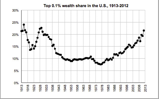
Saez and Zucman’s wealth inequality measure, as well as a similar income inequality estimate by Piketty and Saez, derive their source data from historical income tax returns provided by the IRS. In one sense, income tax returns are an important point of data for something that is notoriously difficult to measure: an accounting of individually held “wealth.” It comes with a substantial liability though. As Alan Reynolds has repeatedly pointed out, historical income tax data are highly responsive to changes in the federal tax code – as in the types of laws that Congress has passed every couple of years since the income tax was instituted in 1913. Using tax data from before and after a major tax code overhaul (such as the one that happened in 1986, to use a prominent example that likely distorts the post-1986 Saez-Zucman numbers) runs a high risk of creating an apples-to-oranges comparison. Changes to the tax code alter everything from the simple top marginal rate of taxation (which Piketty et al stress) to the types of income that are taxed, the number of exemptions and deductible items, the eligible tax base, and even how the income tax interacts with other closely related types of taxation.
Despite this intuitively obvious problem, Piketty et al pay shockingly little attention to historical changes to the tax code in their analysis. In fact, Piketty regularly fumbles the basic legislative history of the income tax in the 20th century. Time and again, his writings indicate a complete inattentiveness to the changing structure of the income tax system except for the top marginal rates – and even then he frequently assigns those changes to the wrong years and wrong presidential administrations (he has called these errors “typos” in correspondence with myself and in his public statements, though he hasn’t ever bothered to correct them in his subsequent work).
All of this brings me to an interesting pattern that I have been investigating in recent weeks. One way to measure the effects of changes to the tax code over time is to look at the simple distribution of the income tax burden from year to year. The CBO publishes these numbers periodically for the top shares of income tax payers – both by household and individual burden – going back to 1979. Their numbers show that the tax share paid by the highest quintile of filers has grown astronomically since the first date in this series, with the Top 1% of tax filers leading the way. Owing to differences in methodology and changes in the way that the IRS has reported data over the years, pre-1979 figures are harder to come by. A 2000 paper by Feenberg and Poterba provides one estimate of the tax share for the top 0.5% of household filers from 1962 until its time of publication. I have yet to find any source that systematically tracks these data prior to 1960 though – an issue that is also somewhat complicated by changes in the way the IRS reported its own data as well as gaps in certain years.
Curious about this question, I started to investigate whether an older estimate of the tax share could be derived. It turns out that the IRS records actually tracked the annual distribution of individual tax filings with relative regularity from 1916 onward, making it possible to (1) rank order the total number of filings from the highest tax payer and (2) determine which tax class the cutoff for the top 1% of filers fell under in given years. This allows us to approximate the tax share paid by the top 1% of individual filers within a few fractions of a percentage point, using the corresponding revenue figures from each tax class. What follows is a rough estimate of the tax share paid by the top 1% of individual filers from 1916 to the early 1960s, when the IRS changed its reporting practices. I note with some caution that these are preliminary estimates that I hope may be further fine tuned. As a point of reference, they are overlaid with the Feenberg-Poterba household estimate for the top 0.5% in the mid 20th century and the CBO-derived figures for the top 1% of filers since 1979, using their estimates for individuals (again, I’ll stress that each uses a different way of estimation and different categories of filers so they are not directly comparable but they do show the larger patterns at play). Even with this very preliminary look though, it is readily apparent that the tax share paid by top income tax filers is highly responsive to the changes in tax code over the past century.
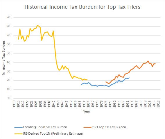
Also note that a pronounced U-shaped pattern emerges, with an almost identical shape as the income tax-derived estimates that purport to measure various types of “inequality.” I’ll leave it to the reader to interpret what that might mean about those estimates.