One of the main critiques I’ve made of Thomas Piketty’s data, starting on this blog last May and appearing in my newly released paper with Robert Murphy on the subject, concerns his Figure 10.5, purporting to show the trend of wealth inequality in the United States. As I pointed out at the time, this chart suffers from severe distortions starting in the 1970s that come about from Piketty’s unconventional decennial averaging techniques. The result is a downward distortion that gives the appearance of a clear bottom point in 1970, followed by a steady increase in inequality through the present day. Piketty attains this composite trend by essentially cherrypicking from different data sources until he produces the story he wants to depict, even as the trend he claims is far more ambiguous in the raw numbers.
Though his citation practices are often opaque, I reconstructed and labeled the source match-up for Figure 10.5 in the following graph so you can see the cherrypicking at play:
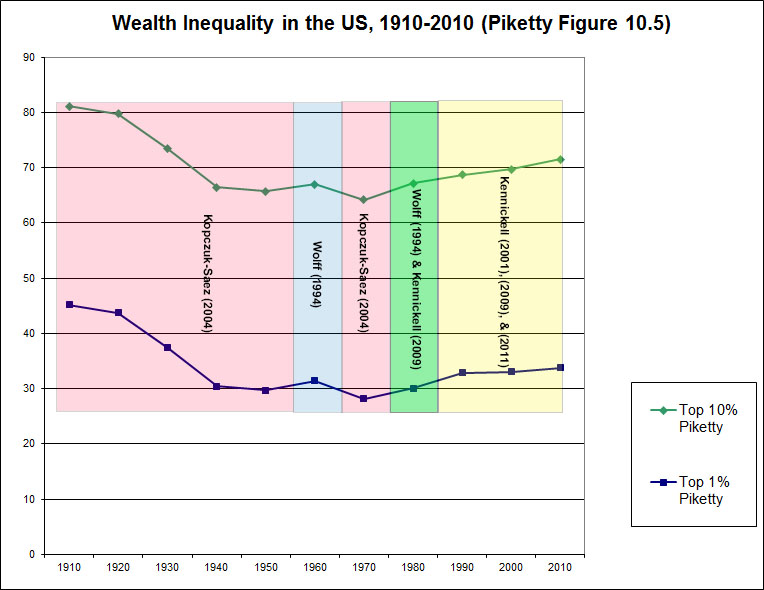
Basically he uses an estate tax-derived estimate of US wealth distributions by Kopczuk & Saez (2004) until the 1960s, switches to a Survey of Consumer Finances (SCF) estimate for the 1960s from Wolff (1994), switches back to Kopczuk-Saez for the 1970s to create the depicted trough, and then lifts from two different sets of subsequent SCF studies by Wolff and Kennickell (2009, 2011) from the 1980s onward to create the purported upswing in inequality. The entire depicted trend from the 1970s forward is not a product of the source data, but rather Piketty’s picking and choosing between different sources in a way that yields the result his broader argument expects to find.
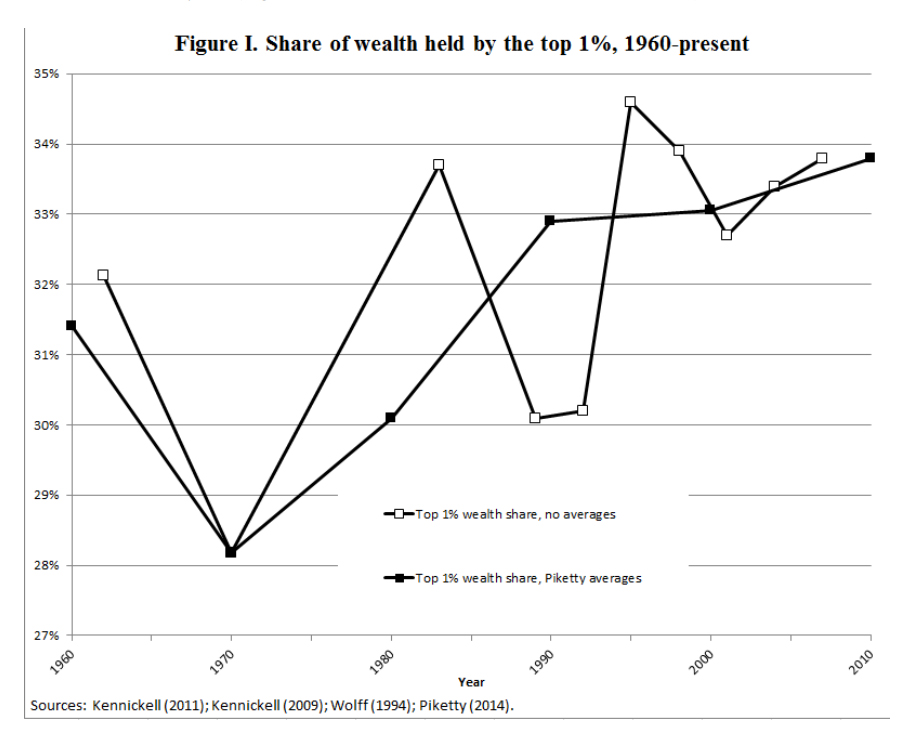
The American Economic Association is holding its annual meeting in Boston tomorrow, with a featured session on Piketty’s book. One of the papers at this session by Alan J. Auerbach and Kevin Hassett speaks directly to the aforementioned problems in Figure 10.5, with some similar findings. They also take a brief look at statistical significance – something that is notably missing from most of Piketty’s work – and find less-than-stellar results. The paper may be downloaded at this link. The relevant section starts on the bottom of page 2, running through the top of page 6. Their summary of the discussion is particularly interesting, and echoes some of the same issues I’ve pointed out:
“When presented in the manner depicted in Figure I, the post-WWII trend in American wealth inequality does not look as stark as in the comparable chart in Capital. Indeed, inequality appears to be declining at the end of his sample. The series no longer rises without interruption in an apparently deterministic trend from 1970 onward, and appears too “noisy” to provide evidence of the working of a “fundamental law of capitalism.” Though the 1 percent’s share of wealth rose from 1970 to 1983, it then dropped through 1992 before reaching a post-war peak in 1995 that preceded yet another decline through 2001.”
They also perform their own reconstruction of the Wolff and Kennickell SCF data sources, comparing the raw numbers against Piketty’s unconventional decennial averaging techniques. The differences are stark. Piketty depicts the clean upward line (itself a product of “smoothing” caused by the decennial average), whereas Auerbach and Hassett’s raw data reconstruction is jagged with no discernible overall trend but lots of fluctuations.
It will be interesting to hear how Piketty responds to the AEA session in the coming days, as it seems that the substantive problems with Figure 10.5 are starting to attract a fair amount of scrutiny.