U-curves are all the rage in inequality studies. Increasingly viewed as a global phenomenon, the distribitional U-curve attempts to show changes in top income and wealth shares over the course of the last century. In other words, it tracks the holdings of the top 1%, 5%, or 10% and so forth over time.
The common story behind the U-curve is one of a great levelling in top income shares up to and including the World War II era, followed by a rebound that’s supposedly taken place since the 1980s and that manifests today in political claims about rising inequality. The posited causes for the movements on the U-curve are complex, but the levelling is usually attributed to some combination of disasters in the first half of the 20th century (two world wars, the Great Depression) and to specific policies (progressive income taxes, redistribution, and the modern welfare state). These causal claims are more often asserted than demonstrated, particularly on the fiscal policy side. As a result, the U-curve upswing since 1980 is almost always attributed to a resurgence of fiscal conservatism since the Reagan-Thatcher era that cut into the mid century’s highly progressive income tax structure. Tax hikes, by implication, then become a favored policy to reduce inequality among those who fret about its alleged rise in recent years.
I’ve discussed the measurement problems with the U-curve elsewhere on this blog, but let’s assume for the moment that it reflects the past 100 years and there was indeed a “great levelling” at the mid-century mark. While scholars have focused almost entirely upon tax policy as a driver of this pattern in the United States and western Europe, one other factor on the world scene has received comparatively little study.
Specifically, the rise and fall of communism, and particularly its totalitarian derivatives, appears to have precipitated a dramatic levelling in top income shares at the mid-century. The following chart, generated from the World Inequality Database, shows all currently available estimates for the top 1% income share from communist countries.
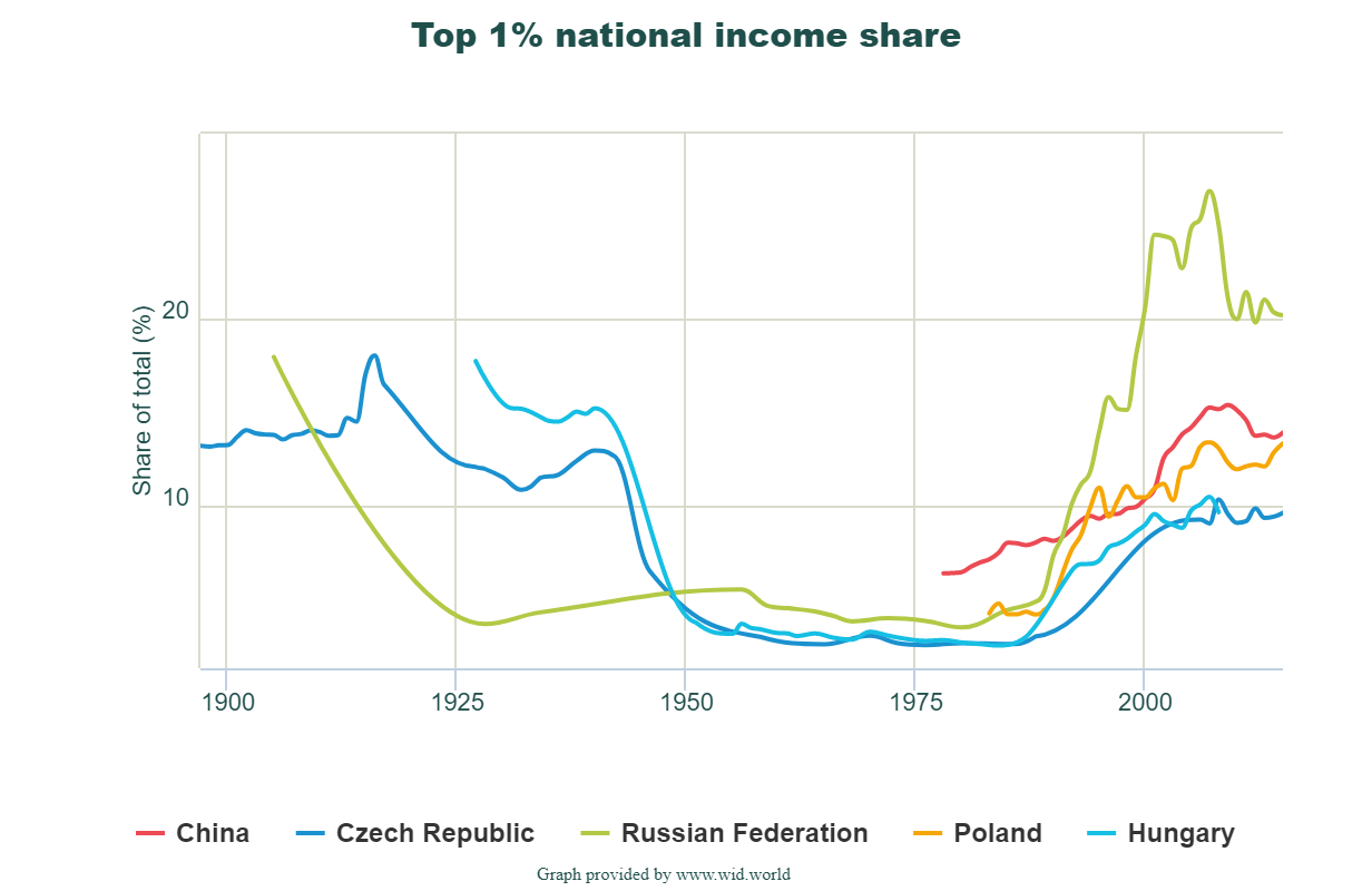
The figure includes century long estimates for the Soviet Union/Russia and two eastern bloc countries, as well as evidence of the rebound since the 1970s in Poland and China. Note that the leveling effect in recorded top income shares is almost instantaneous with the adoption of communism. This much may be seen as well in Russia, which levels some 25 years before the rest of the world. The levelling/rebound pattern seen in the communist world is also atypically severe.
Of course one purpose in my pointing this out is to show that measured income inequality is not an accurate representation of the distributional conditions of material well-being. During the mid-century period, practically all of the countries reflected on this chart were places of severe economic and political repression. Even as they appeared “equal” on paper, that equality entailed a race to the bottom – unless, of course, you were a member of the political elite and therefore enjoyed the non-income luxuries afforded to the communist party leadership. For the rest, communism entailed an equality of shared misery.