Most economic discussions of inequality in the United States begin with a U-shaped curve. More specifically, they begin with historical estimates of top income shares (e.g. the top 10%, 5%, and 1%) as depicted in Thomas Piketty and Emmanuel Saez’s famous 2003 paper on the subject. When these figures are displayed across the entire 20th century they look like a giant U. They show a period of relatively high inequality prior to World War II, followed by a massive levelling at the mid-century mark, followed by an inequality rebound that begins around 1980 and persists to this day.
The Piketty-Saez estimates were a groundbreaking example of historical work that forms the basis for many subsequent studies of inequality today. They also suffer from data limitations, owing to problems of both accuracy and consistency in historical IRS records.
For the past several months I’ve been working on an empirical project (along with Vincent Geloso, John Moore, and Phil Schlosser) that investigates some of these problems. In particular, we look at the portion of the U-curve where these data issues are most severe: 1917 to 1943. Our results produce a series of new estimates for top income shares in this period, accounting for a number of oversights, errors, and problematic adjustments that appeared in the original Piketty-Saez paper.
We focus on three issues in particular, and offer corrections.
The first one derives from the way(s) the IRS reported total income earnings prior to 1944, when it switched to a standardized accounting definition of Adjusted Gross Income (AGI). Think of AGI as your total earnings for the year, minus certain personal and work expenses that may be itemized on your tax form. Prior to 1944, the IRS tabulated tax returns a different way using “Net Income,” which is typically a smaller amount than AGI. The main difference between Net Income and AGI is that the latter includes several additional deduction-eligible income categories such as charitable contributions, interest payments on debt, and state and local taxes. What this means is that pre-1944 tax statistics generally undercount income relative to the AGI standards. As a result you have to harmonize the statistics from these years to get an apples-to-apples comparison with 1944 to the present day.
Piketty-Saez took a shortcut to harmonize the two sets of numbers. They essentially guesstimated how much earners in each tax bracket deducted and adjusted them upward using a single stable multiplier that tiers up its deduction levels to the wealthiest earners. The problem with this adjustment is that taxpayers in the 1910s-1940s actually did not claim deductions at the same rates from year to year. There were even some shifting patterns in deduction rates between high and lower income earners. To correct this, we went back into the data files and extracted totals for the main AGI-eligible deduction categories. Since IRS records were sporadic, we had to estimate missing data in some years by imputation from partial data. Other years in this period have full records of deduction amount by tax bracket. The result is an improved data set that includes reported Net Income plus the main AGI-eligible deductions, and that reflects the year-to-year fluctuations in deduction patterns that are missing from the original Piketty-Saez guesstimation. We then use this improved series to re-estimate top income shares prior to 1944.
Second, we corrected an error in one of Piketty & Saez’s adjustments to account for another recognized problem in the pre-1940 data. Until 1940, the income tax only applied to upper-middle class incomes and higher, but it did so at a distorted rate. Personal exemption levels varied depending on whether you filed as a married couple or a single filer. To account for the “missing” filers under the much higher married couple threshold, Piketty-Saez uses a ratio of married to single filers from after 1940 when the issue was no longer a problem due to expansions of the income tax base. Unfortunately, Piketty-Saez picked a poor year to calculate this ratio. They used 1942. The problem with 1942 stems from the United States’ entry into World War II, which also precipitated a large influx of young single male filers onto the tax roles as they entered into military service. As a result, any married filer adjustment using 1942 as its base ratio will tend to skew inequality upward in earlier years. To fix this problem, we calculated a new base ratio from 1941 (the U.S. did not enter the war until mid-December). This ratio is then used to generate multipliers to perform the necessary adjustment to our results from the first step.
Third, we identified a further distortion in the Piketty-Saez calculations that comes from their selection of a suitable income denominator to actually run the calculations for top income shares. The denominator comes from national income accounts, and is not as much of an issue in recent years owing to standardized accounting practices and high quality data. The 1910s and 20s in particular are a different story, as formal attempts to estimate national accounts were just coming into existence back then. Simon Kuznets (who also pioneered national accounting in the 1930s) produced a denominator estimate in his own 1953 study of income inequality. Piketty-Saez reject Kuznets’ numbers though as being too high and offer a substantially lower denominator. This is a discretionary call, but we believe it is in error because they based it on a comparison with post-1944 tax data, after the aforementioned switch to AGI. This justification does not hold up as well before 1944 under the old Net Income standards used in tax reporting. We accordingly return to the Kuznets estimates and offer a range of plausible scenarios for selecting a denominator while estimating the pre-World War II years.
When all of these adjustments are brought together, we end up with a substantially revised historical series for top income shares. We present a range of denominator options for comparison, but the effect is an across-the-board lowering of estimated inequality prior to 1944. For example, using a 90% Kuznets denominator base, the income share of the top 10% drops by roughly three to seven percentage points in most years. The only exception is an acute inequality spike in 1928-29, consistent with the stock market bubble and crash at the outset of the Great Depression. Our results still show an overall leveling trend between 1929 and 1945, but it is much more gradual than the sharp U-shaped drop depicted in Piketty-Saez.
The next interesting implication of our new series is what it tells us about the century-long story. Since the publication of Piketty-Saez in 2003, other scholars have focused upon the accuracy of their income share estimates from 1980 to the present. One major point of contention revolves around the Tax Reform Act of 1986, which eliminated several tax shelter loopholes that were popular among the wealthy in the mid 20th century as ways to relieve their tax burdens. Piketty-Saez do not account for the effects of this tax code change on how wealthy persons reported their income. The result of this oversight may give the illusion of a more rapid rebound in the U-curve than actually happened. A new study by Gerald Auten and David Splinter offers a series of corrections to the Piketty-Saez series from 1960 to the present that account for this change in the tax code as well as other related scenarios that affect reported income shares. Their results generally flatten the depicted post-1980 upswing of the original U-curve, although they still show modestly rising inequality.
So what happens when you combine the adjustments to the pre-WWII period and more recent times? The chart below depicts the century-long results (in our case using the 90% adjusted Kuznets denominator). The original Piketty-Saez U-curve may be seen in blue. Our pre-1944 revised figures are in red. And the most conservative adjustment by Auten & Splinter is in yellow.
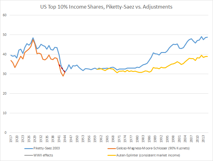
What they show is a century-long pattern that looks more like a tea saucer shape than a U-curve. In fact, the top 10% U.S. income share has remained in a fairly stable 10 percentage point range for the last 100 years, except for the brief aforementioned inequality spike leading up to 1929. If you take the cumulative effect of the adjustments into account, inequality patterns appear to be much flatter and less prone to fluctuation than what we previously believed.