The American Economic Association held its annual meeting in San Francisco this week. Consistent with the recent surge of interest in inequality research, one of the papers generating the most buzz was a new income inequality time series by Thomas Piketty, Emmanuel Saez, and Gabriel Zucman.
The paper itself has not been released yet, but its abstract is intriguing because it suggests that previous studies of the income distribution (including an earlier estimation by Piketty and Saez that is widely touted as the “authoritative” data set on this subject) have missed a modest but certain growth in pre-tax income among the bottom 90% of income earners:
A preliminary PowerPoint of this presentation was posted a few months ago. The Washington Post’s coverage of the presentation, along with predictable political spin, may also be found here.
Much of the discussion from the panel seems to be centered upon this graph in particular, which shows the average income increasing for the bottom 90%, only to be rapidly outpaced by the top 10% of earners. Thus inequality.
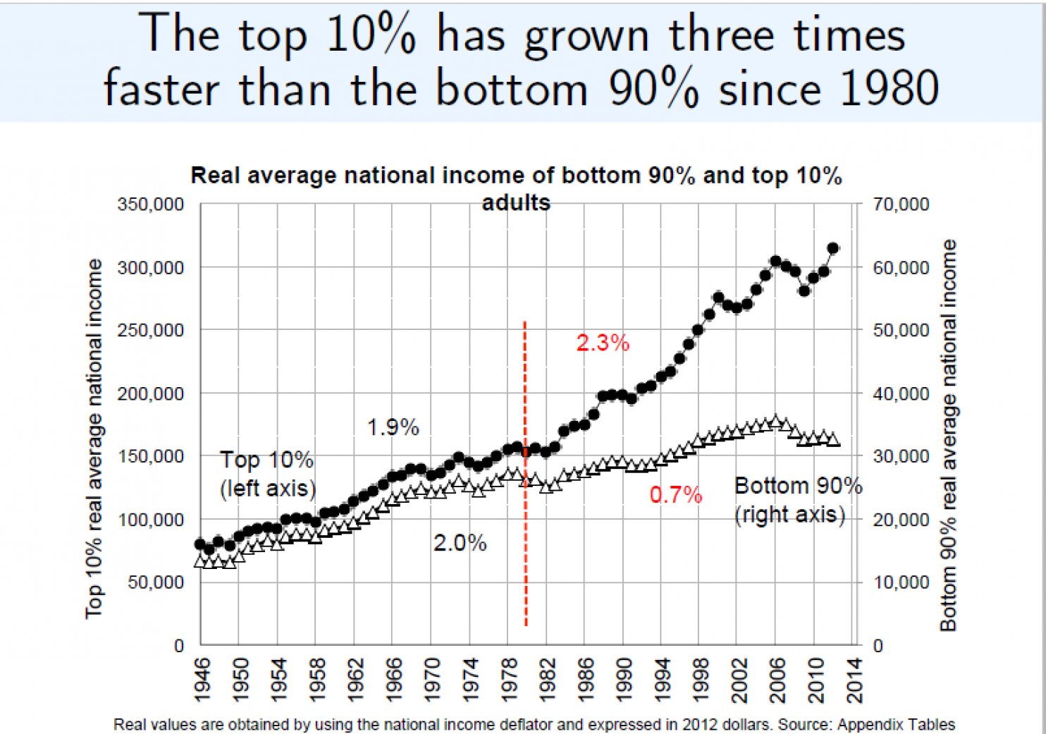
Since the data for this chart is not yet publicly available, I can only eyeball its patterns from the slideshow. Nonetheless a few things immediately jump out:
1. The graph presents data showing the Top 10% has grown “three times faster” than the bottom 90% since 1980, indicated in the vertical red line. My first question is why 1980? There seems to be a strictly political reason for this parsing, given that it immediately precedes the primary “culprit” that Piketty et al blame for modern inequality in most of their research on the subject, the 1981 Reagan tax cut. Yet if one looks closely at the chart it becomes apparent that the two lines still continue to track each other for several years after the 1980 cut. The first signs of a break (I’ll define a break here as a sign of a pattern that appears in the top 10% but not the bottom 90%) do not occur until 1986 when the top line noticeably jumps upward but no similar movement in that direction may be seen on the bottom line, unlike previous instances. Furthermore that break does not seem to accelerate until around 1993 or 1994 (might we accordingly blame the Clinton tax hike instead, if we’re going to go down that route?).
2. Part of the reason for the pronounced shape of the break is simply a scaling issue. The overlay of the two trend lines is mostly a relic of how the two axes are scaled against each other. One could change either the right or left axis scaling only slightly and what appears to be a very large divergence could be made very small, or conversely larger in appearance. For this reason we should not put too much weight into the visual appearance of the trends on this chart, even as the Washington Post article seems to base most of its analysis on doing exactly that.
3. The two trend lines actually depict a few things that Piketty et al do not emphasize in their narrative. I’ll focus on the period before 2007, as both trend lines seem to react to the “Great Recession” with fluctuations that would require a closer look at the actual data to figure out what is going on with each. Eyeballing the pre-recession period from their PowerPoint though, it appears that the average income for the top 10% looks like it grew from somewhere in the neighborhood of $80,000 to about 300,000 between 1946 and 2006 (the pre-recession peak), which gives us a growth of about 375%. The bottom 90% grew from about 12,000 to about 36,000 in the same period, or a 300% growth. While this shows that the rich grew faster than the rest, the overall divergence for the entire period of 1946-2006 is significantly less than the parsing at 1980, which as noted seems to be arbitrary or political.
Suppose for example we made 1990 the cutoff point instead. Starting again in 1946 and eyeballing from the chart, the bottom 90% grew from about 12,000 to roughly 29,000, or 242% in this period. The top 10% grew from 80,000 to 200,000, or a growth of 250%. What this shows, again, is that there really wasn’t much of a divergence between the two lines during the 1980s after all. Or only 8 percentage points difference. Note that this is not anywhere near the rhetoric Piketty/Saez/Zucman are using when they make the Reagan tax cut of 1981 their culprit.
4. As with almost all Piketty/Saez/Zucman inequality charts, the earliest point where one might clearly claim to see a divergence (and a modest one at that) is when the top 10%’s growth accelerates around 1986. I wonder what happened in 1986 that makes that the case? (Hint: see Alan Reynolds’ observation whether Piketty et al are accurately accounting for the 1986 Tax Reform Act and its associated changes to how incomes are reported).
5. The big story of this new time series is actually that it diverges in some fairly pronounced ways from the older Piketty-Saez series on U.S. income inequality, including showing a more moderate “U” shape across the 20th century. If true, this means the older study missed a fair amount of important data that moderates the interpretive claims that have been made about it, including by Piketty et al. Again, we’ve been told for years that the older Piketty-Saez series was the authoritative depiction of income inequality in the US. Apparently this verdict was premature.