Most of my work on Capital in the 21st Century, including the new paper in the Journal of Private Enterprise, has concentrated on data problems in Thomas Piketty’s consideration of the United States. This was an editorial decision made out of space limitations and the U.S. focus of much of the discussion around the book. Since Chris Giles’ original critique in the Financial Times last May, issues have also been raised with the way that Piketty approaches other parts of the world.
Having been recently asked about my thoughts on Piketty’s analysis of wealth inequality in the United Kingdom, I took a close look at the source files. Giles focused heavily on this same data in his own critique, and many of the most salient points and questions he raised went unanswered in Piketty’s response. Instead of the point-by-point rebuttal that is often claimed, this response chose to dwell almost entirely upon a methodological difference over the use of estate tax data vs. survey data to estimate the U.K.’s inequality (here Piketty strongly prefers an estate tax estimate over surveys, or exactly the opposite of the stance he takes with the U.S.). What follows below is therefore a reinvestigation of certain neglected points in Giles’ original critique, along with a few comments building from it.
As with the U.S. estimate, I attempted to directly reconstruct Piketty’s main chart on the U.K. wealth distribution (Figure 10.3) using his cited sources and the data files he posted online. Unfortunately this proved to be impossible with what Piketty gives us due to severely inadequate annotation in the book, appendixes, and data files. While he uses a similar decennial averaging* technique to construct this chart, unlike the U.S. example his averaging formulas are not part of the source data. He calculated them elsewhere and simply transferred the averaged results into his publicly available spreadsheets. A closer examination nonetheless gives us a glimpse at where part of his trend line came from, and also raises numerous questions about the validity of his claims of rising inequality in Britain.
Piketty’s main UK source actually comes from a set of historical series by Atkinson et al (1989), all of which are derived from estate tax estimates. The Atkinson series covers 1923 to 1981, with a few gaps in between. Piketty then extends this series in two directions. First he goes back to 1913, using a single admittedly rougher estimate from Atkinson for that year. Second, he updates it to the present with tax data from the UK government (henceforth denoted as HMRC). The product appears to be a contiguous series from 1913 to the present day. The trend line fits Piketty’s familiar “U-shape” purporting a decline in inequality during the mid 20th century followed by a rapid increase since about 1980.
To begin our examination, I overlaid all of Piketty’s claimed data sources with the decennial averages from his Figure 10.3, following Giles’ starting point. A detailed version appears below:
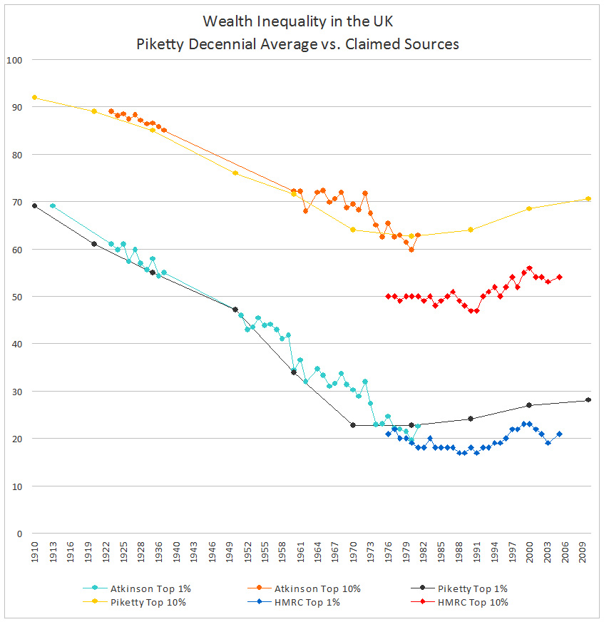
It is easy to see that while the Piketty average loosely tracks the series, there are a number of discrepancies that warrant closer investigation.
I. Atkinson Source Data
Most of Piketty’s numbers come from the first table of the Atkinson study. While it is presented as representative of the UK over this entire period, the Atkinson series actually has multiple gaps and discrepancies that are worth noting:
- Atkinson’s data for 1923-1938 only encompasses England and Wales
- Atkinson contains no reliable estimate for 1939-1949 to coincide with the war period.
- Atkinson resumes in 1950, now providing data for all of Great Britain.
While the variations introduced by these gaps and shifts are relatively small, it is worth noting that Piketty neglects to mention any of them when constructing his chart, which presents them as a smooth and contiguous series.
Another issue emerges in Piketty’s handling of the Atkinson data in his 1950s data point, and it may be yet another small but noteworthy instance of his making up data points to fill in missing gaps in his series. Piketty provides a 1950s estimate for the Top 10% of wealth owners (76%) and cites it to Atkinson. Yet no such number is found in Atkinson, because as Atkinson clearly states in his footnote #2, “For the years 1950-59, the range of the estate data does not allow estimates of the shares of the top 10 percent and 20 percent.” Where then does Piketty obtain this estimate? Giles originally posed this question to him, but he bypassed it in his answer.
II. HMRC Source Data
Since the Atkinson series ends in 1981, Piketty “completed these series with the IRS series for 1980-2010” by using the aforementioned HMRC data. As the chart above suggests, it is fairly obvious that Piketty does something to the raw HMRC data to adjust or reconcile it with the Atkinson series. Or at least he does something to the HMRC’s top 10% figures, shifting them upward by about 10 percentage points. Unfortunately we can only guess what he did here as Piketty provides us no explanatory annotation. He also appears to have performed this adjustment outside of his publicly available spreadsheet as it contains no indication, nor even the results – only a self-reported decennial average of those results for 1980, 1990, and 2010.
The lack of annotation at this point provides a substantial barrier to the replication of Piketty’s U.K. chart as he leaves us no means of ascertaining what he did, or evaluating whether it was an appropriate or correctly administered adjustment. Nonetheless there are a number of discrepancies we can examine further.
III. Piketty’s Averages
The decennial averaging technique has gotten Piketty into trouble before, most notably in his U.S. wealth inequality charts. A similar and in some ways more pronounced issue is present in the U.K. charts. Note the blue arrows on the illustration below:
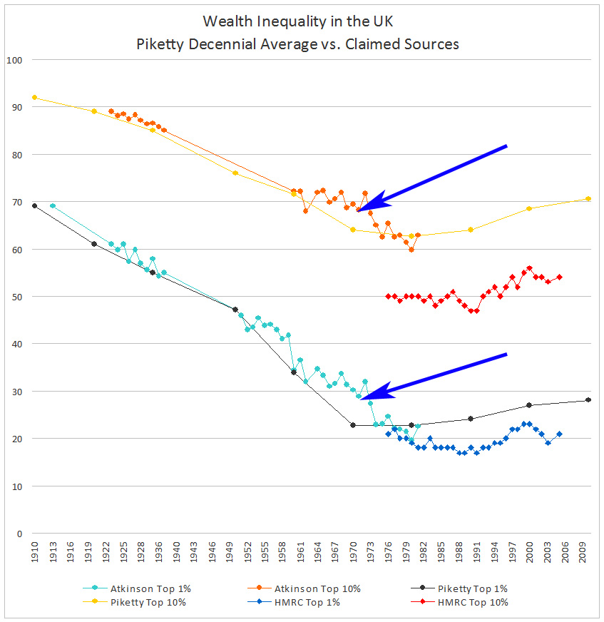
From about 1960 until 1975, Piketty’s constructed trend line consistently understates the annual data found in the Atkinson source. This produces a sizable gap between the two lines, with a notable distortion in Piketty’s depicted trend. Note the top 1% data in particular. Whereas the raw Atkinson data actually shows a jagged but continuous and clearly declining trend from 1960 until the end of the series in 1981, Piketty depicts a sharp kink in 1970 where his lines almost completely flatten out. Piketty then depicts an increase in inequality from 1980 until the present after switching to the HMRC series, as modified by an unspecified and unverifiable adjustment technique. Similar effects are evident in the top 10% trend line, although here the Atkinson data suggest a more modest dropoff.
Now what exactly are we to make of this strange divergence in the series? For starters, it might be yet another instance of confirmation bias at play as Piketty’s decennial average for this period brings the claimed trends closer to his own political narrative than the raw Atkinson data. Notably, the precipitous drop in Piketty’s trends from 1960 to 1970 coincides with a period of sizable progressive tax hikes under the Labour government of Harold Wilson (1964-70). While the Atkinson series shows this decline continuing and actually crossing Piketty’s estimation in 1978 or 1979, Piketty has already turned the trend flat for almost a decade at this point.
Note that 1979 was the election year of Margaret Thatcher’s government, which assumes the role of tax cutting villain in Piketty’s narrative much like Reagan does in the United States. This coincides with his switch to the ambiguously adjusted HMRC series, after which inequality trends begin to rapidly increase.
IV. Piketty’s Trend Distortion
Pay close attention to 1980 on the HMRC data series. While we do not know the adjustment ratio since Piketty neglected to explain it, we may plainly see that the HMRC series remains stable and even declines slightly across the next 10 years in both categories. This is in marked contrast with Piketty’s trend line, which shows an increase in inequality is well under way from 1980 to 1990.
The HMRC data do show a modest uptick in inequality starting in about 1992 and continuing to 2000. Piketty’s trend line follows this. But then they begin to diverge again. The HMRC series shows a clear decline again from 2000 to 2003, then stabilizing in 2005 (the last year in the HMRC series). Yet Piketty’s numbers for this period show a clear increasing trend through 2010. Where does this come from?
Of course Giles posed that same question back in May. Piketty declined to answer, focusing instead on the methodological debate between estate taxes and surveys.
V. Conclusions
The foregoing discussion has highlighted a number of discrepancies in the construction of Piketty’s UK inequality chart while also reiterating and adding to the original examination of this series that was performed by Giles. They are noted as discrepancies because Piketty has yet to provide a clear explanation for them, his existing annotation being entirely insufficient for any further reconstruction of the series. While it is difficult to further determine exactly what Piketty did beyond this point, it is not difficult to see that the noted discrepancies create at least one distortive bend in Piketty’s curve in 1970 that does not appear to be supported in any of his source material. They also show a constructed series that seems to contradict the yearly trends depicted in the raw HMRC source from which it is purportedly derived. That these distortions also seem to fit the political/ideological interpretation underlying Piketty’s historical narrative is also in keeping with patterns found elsewhere in the book.
Given that he has not explained Figure 10.3 in sufficient detail to permit even a basic replication of its depicted results, the reader should resist placing too much credence in the trends it purports to show. Perhaps Piketty has an explanation for the apparent liberties he takes with the UK series, including liberties of omission. Unfortunately it is not possible at present to determine what they are. This is sufficient reason though to be skeptical of any claims that are premised upon this unproven empirical demonstration.
*A note on decennial averages: even where the data are clear, quite a few of Piketty’s reported averages at mid century closely reflect but do not actually match the results of a conventional 10 year average taken from the Atkinson series in the same reported decade. This suggests that Piketty either made yet another adjustment in the series, or he engaged in atypical and discretionary averaging practices to get his numbers. In either case, this information is also omitted from his annotation.