One of the hazards of writing an academic article that garners a substantial amount of media attention is that it will often attract critics of widely inconsistent quality. While some of this criticism can be healthy and foster productive discussions, a fair amount of it tends toward the “grasping at straws” variety.
Earlier this evening Brad DeLong re-posted one such challenge to my forthcoming article, with Robert Murphy, in which we take apart Thomas Piketty’s empirical contributions. One of our primary conclusions in the article is that Piketty exhibits a tendency to cherry-pick his sources and massage his data findings in ways that confirm his prior expectations about the nature of inequality. This is a type of confirmation bias, and it generally indicates that the afflicted work is putting the cart of its own conclusions before the data horse that supposedly sustains those conclusions empirically.
DeLong links to a recent blog post by Daniel Kuehn, which in turn takes issue with our finding of biasing distortions in Piketty’s main chart for inequality in the U.S., Figure 10.5. While neither DeLong nor Kuehn seem to dispute the existence of several distortions that we identify in Piketty’s work that end up accentuating his inequality thesis, they do seem to contend that other decisions by Piketty work in the opposite direction – in effect, balancing out some of the biases and giving him a more even-handed approach to the data. Specifically, Kuehn claims to have identified three examples in the construction of Figure 10.5 where Piketty’s data decisions – we are told – actually “work against his narrative” on the inequality dynamics of the United States. Since our analysis contends that Piketty’s decisions are overwhelmingly one-sided in support of his inequality narrative, these examples – if true – would potentially weaken our case that Piketty’s biases undermine a core part of his empirics.
Now Kuehn isn’t exactly the most lucid writer in the economics blogosphere, so it’s sometimes difficult to discern what he is trying to say from his writings. With that caveat in mind and making an honest effort to capture the gist of each point, I put his three purported examples to the test to see if they materially alter Piketty’s figure 10.5 in a way that works against the inequality narrative, as claimed. To do this I reconstructed the Piketty trend line by removing the alleged narrative-damaging adjustments that Kuehn identifies and compared the results to Piketty’s unaltered Figure 10.5.
To put it mildly, one could say that Kuehn vastly overstates the importance of all three of his examples. Not only do they fail to substantively alter Piketty’s figure in ways that disrupt or work against his inequality narrative, but they also barely even register any effect upon the shape of that figure. At all.
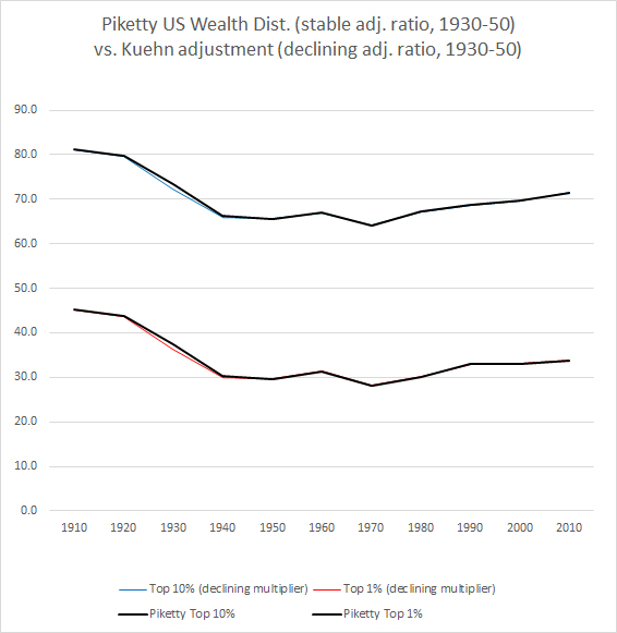
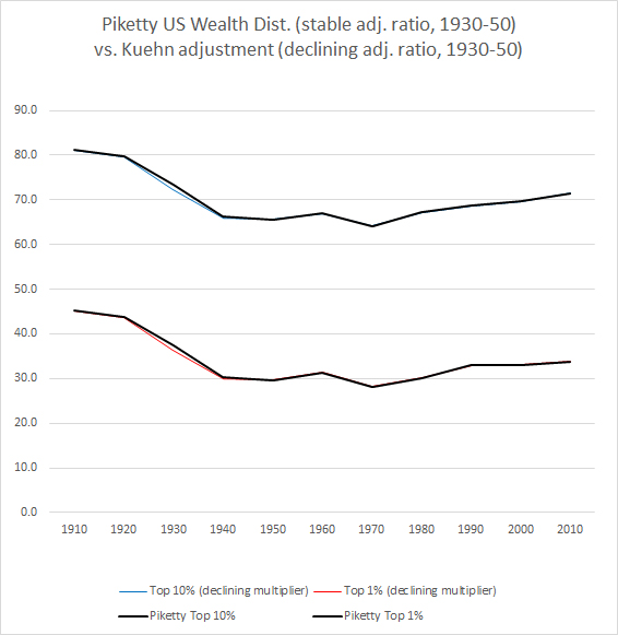
Example A: Piketty uses of a stable adjustment ratio of 1.25 from 1930 to 1950 to reconcile the Kopczuk-Saez data series with the later and slightly higher SCF series. Kuehn claims that this “stable multiplier is an odd choice” because he believes the ratio was declining the further back in time you go, eventually reaching the 1.20 ratio that Piketty uses for 1920. To test this I reconstructed Piketty’s chart with the declining ratios that Kuehn prefers for the decades in question, assuming a constant rate of reduction. The results are as follows, though I suggest obtaining a magnifying glass to view them as the effect is almost imperceptible:
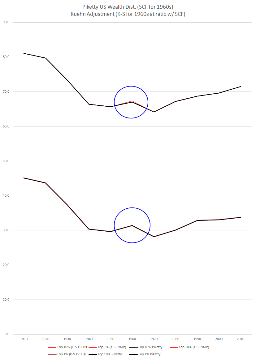
Example B: In the 1960s Piketty (briefly) switches from the Kopczuk-Saez series to the SCF. He does so by adjusting Kopczuk-Saez upward so that he directly reconciles the two – meaning the adjusted Kopczuk-Saez average is set at the same level as the SCF for the top 1%. Even though they are the same, Kuehn suggests that switching to the SCF at this point somehow works against Piketty and makes “the mid-century Golden Age a little less Golden.” Setting aside for the moment that Piketty seems to associate the 1970s with a golden age much more strongly than the 60s, dropping the 1960s SCF point for Kopczuk-Saez actually doesn’t make the 1960s more equal…unless one also jettisons the SCF-based adjustment ratio for a randomly chosen number, which would make no sense. Anyway, here is Piketty’s Figure 10.5 overlaid with an adjustment that drops the 1960s SCF. You’ll want to keep that magnifying glass out, but even then the difference is imperceptible without stretching out the chart because it is actually nothing more than a residual of rounding between two numbers that have already been reconciled:
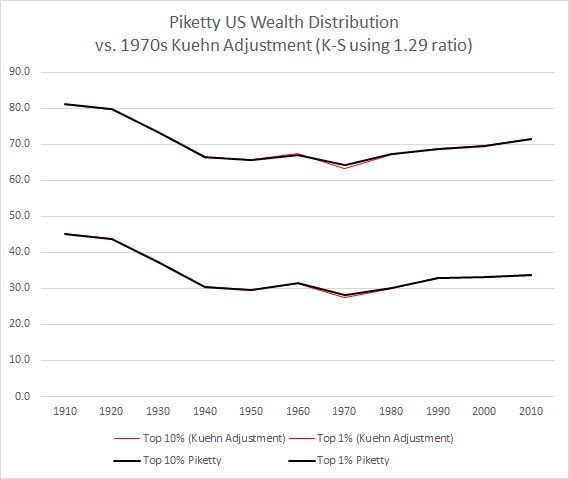
Example C: In the 1970s Piketty quietly reinserts the Kopczuk-Saez series into his chart by blending it with the prior decade’s SCF point. His doing so has the notable effect of creating a pronounced trough in his trend line, supposedly signifying the lowest inequality level of the entire century. Kuehn suggests that this blending also somehow works against Piketty, and that an adjusted Kopczuk-Saez trendline without the 1960s SCF reconciliation point would show a deeper 1970s trough. How much deeper, you might ask? Pull out your magnifying glass again and see:
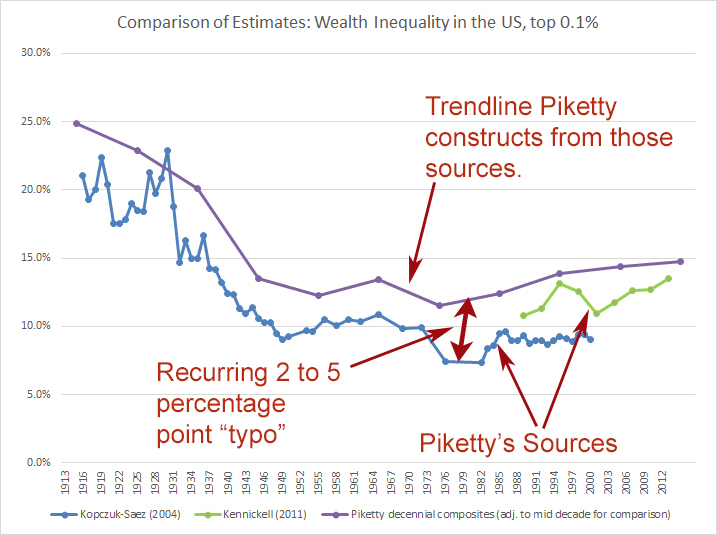
Recall that in these three examples, Piketty is said to have done something to the data that allegedly “worked against his narrative.” Also recall that the persons making this claim have been quite content to casually overlook multiple instances where Piketty massaged the very same data in favor of his narrative, yielding divergences of 5 percentage points (and higher) between Piketty’s constructed trend line and his claimed data sources. For an example see this wherein Piketty’s trend for the top 0.1% is compared against his raw sources:
By contrast in all three cases referenced in DeLong’s question and the accompanying blog post, the alleged disadvantage posed by each to Piketty’s narrative is simply nowhere to be found. Indeed, even where it registers it is so small as to be practically imperceptible. Keep straining away at those gnats as you continue to swallow Piketty’s camels though!