Following this afternoon’s post, I decided to dig a little further into Thomas Piketty’s data spreadsheets. I’ll start with two general observations:
I. Decennial Averaging
Piketty seems to have an inordinate fondness for converting his data into decennial averages. Usually this is done by the not-terribly-sophisticated technique of simply adding up annual stats (or in many cases percentage representations of those stats) and dividing it all by ten…or in the example I highlighted from my last post, dividing by whatever number of data points he happens to have for that decade, even if it is only two years out of ten.
This technique tends to yield very simple and visually accessible graphs that purport to represent extensive trends over time – usually a century or more. It’s not immediately clear though why he chooses decennial averages – there’s nothing special about years taken in clusters of 10 that merits their grouping – and in fact they seem to introduce a number of problems into his study. Usually his decennial averages actually come at the direct expense of finer points of nuance because (1) they obscure fluctuations that happen within the course of a decade through the averaging itself and (2) they conceal events that occur across the closing or opening years of a decade by artificially parsing them around calendar years that end in zero. Where data points are missing in a given decade, they also have the effect of inflating the weight with which the available data points register on the overall graph. It is also quite odd that he would employ decennial summaries – a technique that is better suited for periods of history with pervasive data gaps – for mid and late 20th century macroeconomic indicators where annual and even more refined data points are readily available.
Now some of the commentary around the Piketty controversy has suggested that he employed various “smoothing” techniques to improve the presentation of his data. This is called eliminating the noise, or rapid and short term fluctuations from a time series that can obscure larger relevant trends. The problem here is that decennial averaging simply isn’t a very robust smoothing technique when annual data is reliably available. If he wanted to remove short term noise, at minimum he should have applied a moving average. A more sophisticated analysis, and particularly in cases where he asserts or implies future trends, would require running an ARIMA model or at least fitting some sort of rudimentary trend line to his data. Instead we have back-of-the-envelope decennial averages, and far bolder claims made upon them than they actually support.
The bottom line: for all the hype around his statistical methodology, Piketty is peddling some very, very amateurish stuff.
II. Data Gaps…and filling them in
On more than a few instances Piketty appears to supplement gaps his data by simply making it up, and needlessly so. The Financial Times analysis pointed to a number of aberrations of this sort, including instances where he randomly added numbers into data for certain years for no particular reason, or at least with no ready explanation. It’s more of a case of carelessness than organized deceit, but it seems to be pervasive enough to severely taint his data.
Take the following example, which I happened upon this evening. Piketty’s Figure 13.1 contains a tax revenue-to-GDP ratio for the US, UK, Sweden, and France (presented as decennial averages of course, even though annual data is readily available). It’s used to make an interpretive point about the expenditure functions of the state relative to its tax system, but the data itself is fairly mundane stuff. Or at least it should be. His source chart for the figure is copied below. In this case I’ve selected the cell for the US ratio in the 1910s, showing the decennial average formula.
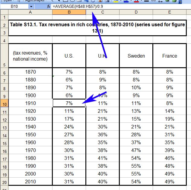
This methodology is suspect for reasons noted, but so far things appear to be in order at least with the way it is applied.
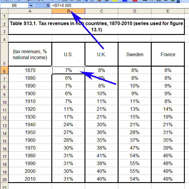
But what happens if we arrow up a couple of cells to 1870s? Here we have a new number with a new formula, except instead of an average drawn from his raw data source, it appears to be the cell for the 1880s plus a small tweak to yield a slightly different result.
So why the discrepancy? Even though Piketty’s dataset does not include US tax revenue figures prior to 1902, it cannot be for a want of data. There are indeed reliable and annual tax revenue records going back for most of the 19th century (in 1870 it was about $411 million though it dropped precipitously across the decade amidst an economic downturn in 1873), and national income has been reliably estimated for the late 19th century. Piketty simply didn’t do the research to find it. Just for fun, here’s a quick graph I made covering the relevant period from US Treasury records.

But Piketty’s source material does not have this sort of data for the US, and accordingly he lacks a tax revenue-to-GDP ratio for those years. So what did he do instead? For that we need to change the display settings to show decimals, including the tweak in his formula (which also appears for 1880 and 1890). Notice something odd about the first four figures.
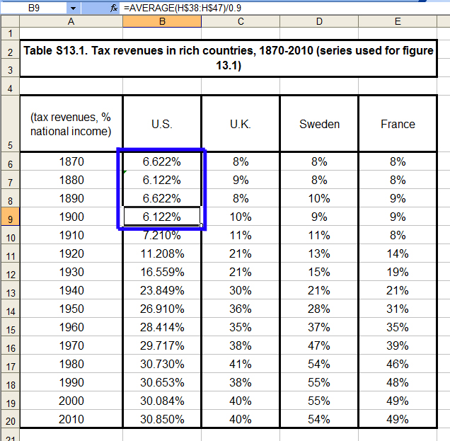
They pivot between 6.622% and 6.122%, with the source being 1900 (itself another decennial average, albeit an incomplete one because he only has data for 8 of the 10 years). Rather than locate the readily available stats for the previous three decades, he randomly added or removed .5% in alternating fashion. Note that his figures for the UK, Sweden, and France in these same three decades do suffer from missing data points that are obscured (again) by decennial averaging, but they are at least based in sporadic bits and pieces of historical data that he has assembled. But for the US numbers, he simply made them up!
Now admittedly this is a small point on a perfectly noncontroversial chart, done apparently for no other reason than to avoid the labor of obtaining US historical records for a relatively unimportant older figure. It’s probably not even all that far removed from the actual revenue-to-GDP in that period, which tended to fluctuate from about 4-8% in any given year of the late 19th century, depending on changing tax regimes and the national income estimate used. But it’s also exactly the type of slipshod data handling that seems to be pervasive in Piketty’s work.
When his data had a gap Piketty did not address it by doing further research to fill the gap. Nor did he openly acknowledge his limitations by omitting the missing numbers and explaining their absence to the reader. Instead he made something up out of thin air, integrated it into his charts and graphs as if it were a part of the same continuous data set derived from the sources he claimed, and hoped that nobody would notice.