This is what happens to Piketty’s Figure 10.5 if you remove the problematic 1970s data point:
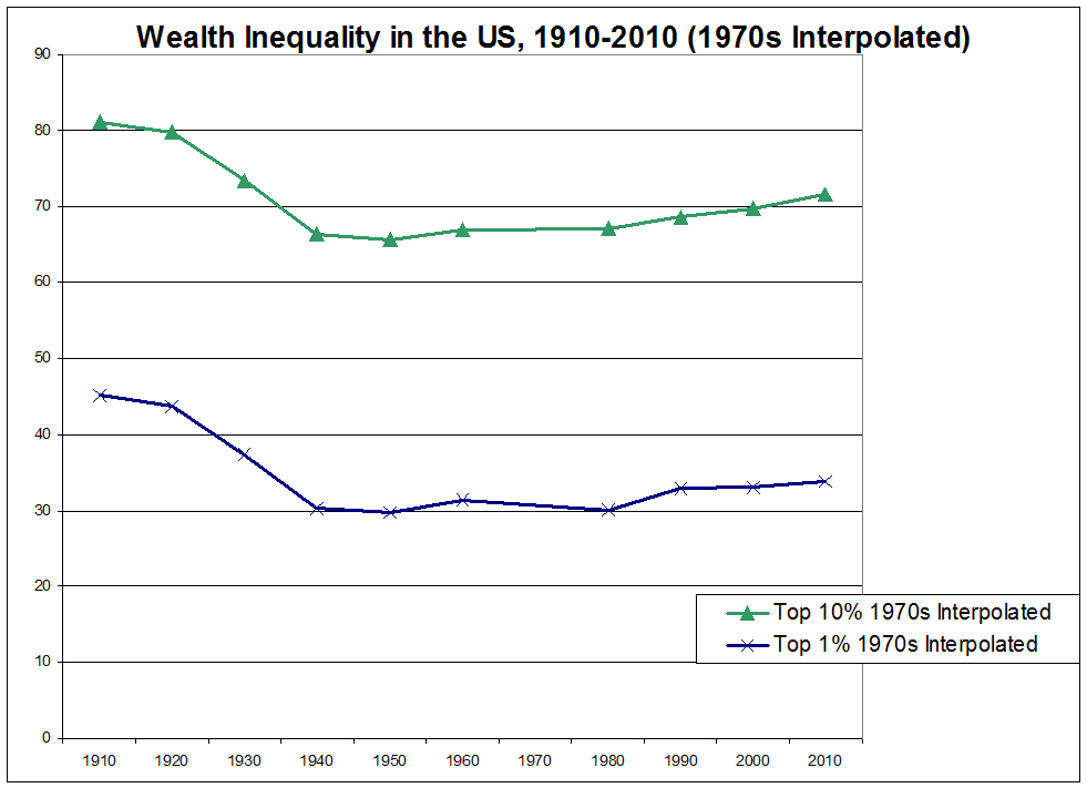
Note that I am not endorsing the accuracy of the result, which is still plagued by other questionable data techniques. It also seems reasonable to include an appropriate accounting for the 1970s, assuming one exists (I’m simply saying that Piketty’s number here is distortive and problematic). But two clear observations may be made from this modified figure:
1. The post-depression accounting of the US wealth distribution in this figure is significantly flatter than Piketty’s actual Figure 10.5. It shows no clear turnaround point in the direction of the trend, and the claimed late 20th cenutyr rise in inequality is at most a very modest, slow, and gradual uptick.
2. This is actually the graph that Piketty claimed he made in his technical appendix.
If that sounds somewhat surprising, let’s walk through what he claims he did. Here is the descriptive passage from p. 58 of the technical appendix for reference:
Note that he divides the source material he cobbled together into Figure 10.5 by a range of years.
1916 to 1962 come from Kopczuk-Saez
1962 to 1989 come from Wolff (1994)
1989 to 2010 come from two studies by Kennickell along with adjustments from Wolff (2010)
Yet as I noted the other day, Wolff (1994) only contains data points for 1962, 1983, and 1989. It does not have any measures for the 1970s. Though he did not reveal as much in his annotation, Piketty actually obtained his 1970s estimate by returning to Kopczuk-Saez after his 1960s detour to Wolff and used the two slim data points in their set to claim a figure for the entire decade.
So as noted above, my adjusted graph is what Piketty’s Figure 10.5 would look like if he did what he claimed in his own technical appendix.
Here is what Piketty published as Figure 10.5, overlaid with my 1970s adjustments (the dashed lines) as a reference point:
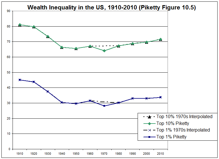
This is how he gets the kink in his chart at the 1970s. And that kink subsequently allows him to make the much-publicized and vaunted claim of his work for the US: that policy changes in the 1980s (i.e. tax cuts) have led to a clear trend of increasing wealth disparity that continues to this day and – by implication – will continue for some years to come. Note that this is an explicitly historical argument built around a narrative of what the data purports to show. And Piketty does indeed tell that narrative in Capital in the 21st Century, presenting a post-1970s US where tax cuts and other “socially unjust” policies lead to increased wealth disparity, specifically making reference to his data in Figure 10.5 to bolster the claim.
If there is any remaining confusion that this is indeed a central point of his narrative though, I would direct you to this highly touted piece from May 27 in the New Yorker, which attempts something of a defense of Piketty from the Financial Times and other data critics. The author’s unequivocally stated retort is that Piketty showed an increase in US wealth disparity that is allegedly consistent with the other statistical literature (he omits studies where this is not the case, but we’ll let that slide for the moment).
Note in particular that the New Yorker selects one of Piketty’s graphs, which it defends as accurate and purports to consistently represent his observations about the increase in wealth inequality in the United States. That graph is Figure 10.5.