The original post that started my ongoing examination of Thomas Piketty’s data specifically examined a series of irregularities on Figure 10.5, one of his key graphs to sustain his thesis of a trend of increasing US wealth disparity since the 1970s.
As I noted, Piketty seems to be using a decennial averaging technique to clean up a very incomplete data set covering the past century in the United States and to integrate his main source – the Kopczuk-Saez data set – with two other data sources that fill in some of the gap years. The largest gaps in Kopczuk-Saez occur between 1960-1980, with only two data points for the entire 1970s.
According to Piketty’s appendix (p. 58), he claims to have used Kopczuk-Saez for the years 1916-1962 and a more recent Survey of Consumer Finances-based estimate by Arthur Kennickell for 1989-2010. What about 1962-1989 though? According to Piketty, he used a separate paper by Edward N. Wolff (1994) to fill these gaps. Except this isn’t entirely the case…
Piketty does indeed pull in Wolff, but as the chart below shows Wolff (1994) only supplied him with 3 years of data (see Part A, columns for the top .5% and next .5%) – 1962, 1983, and 1989. As far as the 1980s go this is also a somewhat odd “supplement” to make, considering that it reduces his average from the eight 1980s data points found in Kopczuk-Saez to only two, albeit estimated with a different methodology.
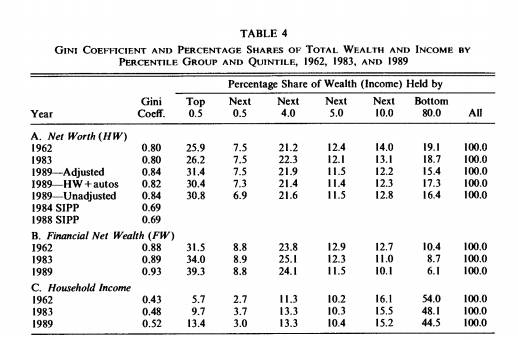
Piketty clearly uses Wolff’s 1962 figures to augment his 1960s estimate from the Kopczuk-Saez set. This may be seen in the cell formula below, where he directly codes them into the 1960s calculation, which he then uses to calculate similar averages for the top .1% and the top 10% (more about that shortly).

Strangely missing though is any indication of a supplemental data source for the 1970s. This is important to note because the 1970s is the key to Piketty’s entire argument, at least as far as this chart goes. As this is fundamentally a historical argument, I’ll let Piketty explain how the theorized post-1970s turning point in wealth disparity fits into his larger thesis. According to Capital in the 21st Century:
“In the United States, perceptions are very different . In a sense, a (white) patrimonial middle class already existed in the nineteenth century. It suffered a setback during the Gilded Age, regained its health in the middle of the twentieth century, and then suffered another setback after 1980. This “yo yo” pattern is reflected in the history of US taxation. In the United States, the twentieth century is not synonymous with a great leap forward in social justice.” (p. 248)
What he’s claiming here is supposed to be reflected in his graph, to wit: starting at the Gilded Age peak we see a half century decline in wealth holdings by the top 1% and 10%. This trend reaches a bottom in the 1970s (the kink we see on his graph at the arrow below) and then reverses course after 1980 – a trend he attributes to the Reagan era tax cuts – where it has continued upward ever sense.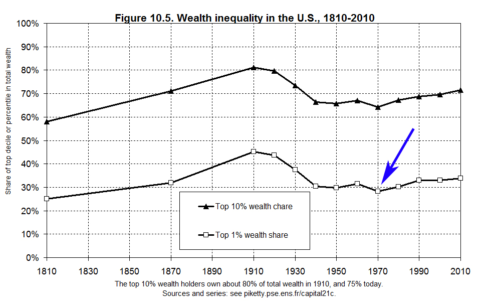
This is why the 1970s data point matters so much. So what, then, is wrong with Piketty’s 1970s data point? It is actually not taken from Wolff as his admittedly unclear annotations seem to suggest (and as p. 58 of his appendix claims) but rather a recalibration the Kopczuk-Saez set. And as I detailed the other day, Kopczuk-Saez contains only two years’ worth of data points for the entire 1970s. This may be seen in Piketty’s formulas as I displayed the other day, but to be absolutely clear, here is what happens to Piketty’s calculations when I delete 1970s the Kopczuk-Saez data points from his spreadsheet:
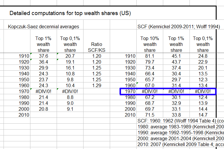
In other words, dropping Kopczuk-Saez breaks his entire set of 1970s decennial averages.
This is all quite problematic, because the two 1970s data points for Kopczuk-Saez show a very pronounced drop between them, and a decennial average that relies on only two data points will similarly reflect the severity of that drop, whereas it would be flattened by an average taken from ten full data points, as with previous years. You can readily see both the drop and the paucity of 1970s data vis-a-vis other decades in the graph from Kopczuk-Saez below:
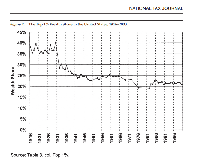
But notice something else about Kopczuk-Saez. Their data for the 1980s and 1990s is virtually flat. This is also the point where Piketty drops them from his graph, switches to a different calibrated average from Wolff for most of the rest of the 1980s, and then switches again to the Kennickell SCF-based index for the 1990s-2010s.
The choices to switch and supplement datasets may have a rationale behind them, and it may even be the case that the two supplemental sources – Wolff and the updated SCF survey – are more accurate representations of post-1980s data. But they are choices of data construction nonetheless, and choices that result from Piketty’s discretion alone. They are also choices that have very specific implications for the shape of the resulting chart:
1. By using the problematic 1970s average drawn from only two data points showing a pronounced dip between them, Piketty accentuates the severity with which that dip registers on his cumulative graph. Fluctuations in prior years, by contrast, tend to be absorbed in decennial averages based on ten rather than two data points.
2. By switching away from the Kopczuk-Saez data set – which is actually flat from the 1980s onward – to calculate his decennial averages in the 1980s-2010s, Piketty ensures that already-accentuated 1970s dip is immediately followed by a continuous upward trend.
3. When Piketty blended the supplemental sources into Kopczuk-Saez, he found that the supplemental estimates tended to show slightly higher levels of wealth concentration than Kopczuk-Saez across the board. He addressed this by recalibrating all of the Kopczuk-Saez-based decennial averages upward to sync them up with the supplemental sources. Therefore wealth concentration also registers slightly higher across the board on Piketty’s constructed graph than it does on his main root data source.
Note that the resulting graph comports directly with Piketty’s historical narrative, found in the excerpt above and repeated at multiple points throughout his book, to wit: starting with a high watermark of wealth inequality in the Gilded Age, US wealth disparity dramatically declined across the mid 20th century to a 1970s low, then – spurred by the 1980s tax cuts and other related policies – started a sustained reversal into the present day, with a clear trend toward returning to those Gilded Age peaks. If this all sounds a bit post-hoc in its rationale, that’s because it is (and indeed others have found basic errors in his recounting of historical tax and minimum wage rates for the US). It seems we now also have an unfortunate bit of confirmation bias at play in the graph he produced to accompany this narrative.
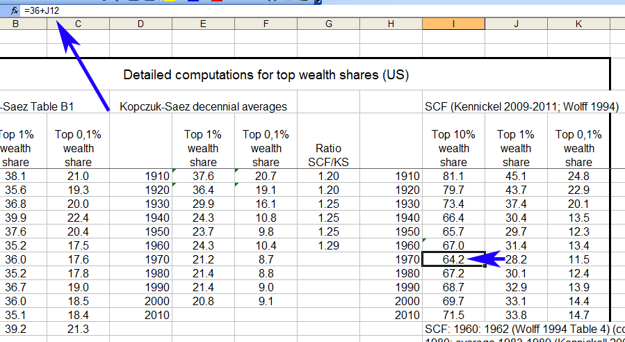
Note that the Kopczuk-Saez set and Piketty’s aforementioned modifications and supplements all pertain to estimates of wealth held by the top 1%, plus a narrower index of the top 0.1% “super rich.” Yet as I mentioned above, Piketty’s Figure 10.5 also contains a parallel representation for the top 10%. So where exactly did this second set of numbers come from?
One of the unanswered questions posted by the original Financial Times analysis gives us some clues – Piketty’s top 10% data is actually just a simple – and highly questionable – modification of his decennial average for the top 1%. Here he simply takes the already problematic graph he devised out of Kopczuk-Saez with the Wolff & Kennickell supplements and adds a fixed percentage – 36% for most decades, though in his 1980s-2010s data points seem to incorporate averages of different data – to get his overall result. This can be seen in the spreadsheet below, where Column J is the top 1% decennial average that he compiled in the manner I have deconstructed and detailed above and Column I is the addition of the fixed percentage to the results of the 1% average.
I’ll leave it to the reader to evaluate the validity of this approach.